
How can we make a digital archive more accessible for all users?
missouri digital archives
missouri digital archives
A website redesign focused on improved accessibility, search functionality, and usability.
Client
Missouri Digital Heritage
Date
September 2023 - December 2023
Industry
Government
Scope of work
Website Redesign
Interaction Design
UX/UI Design
Interaction Design


INTRODUCTION
THE CHALLENGE
The Missouri State Archives site, built on CONTENTdm, poses usability issues for researchers due to poor search, inaccurate OCR, and a confusing interface. Its lack of accessibility features also limits access for visually impaired users, reducing overall usability and inclusivity.
MAIN OBJECTIVE
Our goal was to redesign the website to improve search, streamline navigation, and create a more efficient, user-friendly experience for accessing archival materials.
conducting research
SURVEYS
To understand user needs and challenges, we used a Qualtrics survey to gather insights on user demographics, behaviors, goals, and frustrations with CONTENTdm. This method allowed archivists and researchers to share detailed, reflective feedback efficiently, helping us uncover key usability issues and design opportunities..
research results
KEY INSIGHTS FROM USERS
Confusing Navigation: All users struggled with unintuitive navigation, often resorting to trial-and-error or browsing like a physical book.
Poor Search Functionality: Search was described as overly complex and ineffective, with users preferring to manually browse rather than use keyword search.
Accessibility Barriers: Screen readers cannot access non-transcribed content (like handwritten letters), limiting accessibility for visually impaired users.
Varied Usage Patterns: Users ranged from occasional to daily use, primarily for tasks like genealogical research, viewing documents, uploading materials, and creating metadata
Define
USER PERSONAS
After analyzing our research, we created personas and scenarios to better understand user needs and build empathy.
design plan
CONCEPTUAL MODEL
Upon arrival, users should encounter a clean homepage with a brief introduction, search bar, browse button, and clear instructions. Experienced users may dive straight into search, while others can explore the guidance provided.
The interface should feel familiar and intuitive. Searching mimics using a browser, browsing resembles exploring a library, and scanning results is akin to reading a menu or scrolling Google.
Key improvements include clearer download buttons, intuitive navigation arrows, adjustable font sizes, and responsive features like tooltips and helpful error messages to support less experienced users.
INTERVIEWS
In addition to surveys, virtual interviews were conducted to gain further insight on common frustrations within CONTENTdm. This method allowed interviewees to share their screen and explain in further detail


UPDATED INFORMATION ARCHITECTURE
Below is the high-level architecture blueprint for the proposed system.
TESTING THE WIREFRAME
Reviewers responded positively to the redesign, especially the improved homepage, accessibility features, and refined search pane, which effectively supported user tasks.
Key functions were well-placed, though consistent placement of the document search panel—ideally on the left—was recommended for better alignment.
The use of white space, grouped content, and collapsible boxes was praised for reducing cognitive load and improving clarity.
Visuals were seen as solid, with suggestions to further refine fonts, colors, and imagery to strengthen the site’s identity and purpose.
POST-OBSERVATION QUESTIONS
After completing tasks, participants answered follow-up questions to gather qualitative feedback on ease of use, clarity, visual design, and overall satisfaction with the redesigned site.
USABILITY FORM
Participants also completed a 10-item usability form via Qualtrics. Using a 5-point Likert scale, the form collected detailed feedback on their experience with the updated website’s design and functionality.
low-fidelity PROTOTYPE
WIREFRAME
The homepage redesign focused on making search options more visible and intuitive by grouping them within a clearly defined search box.
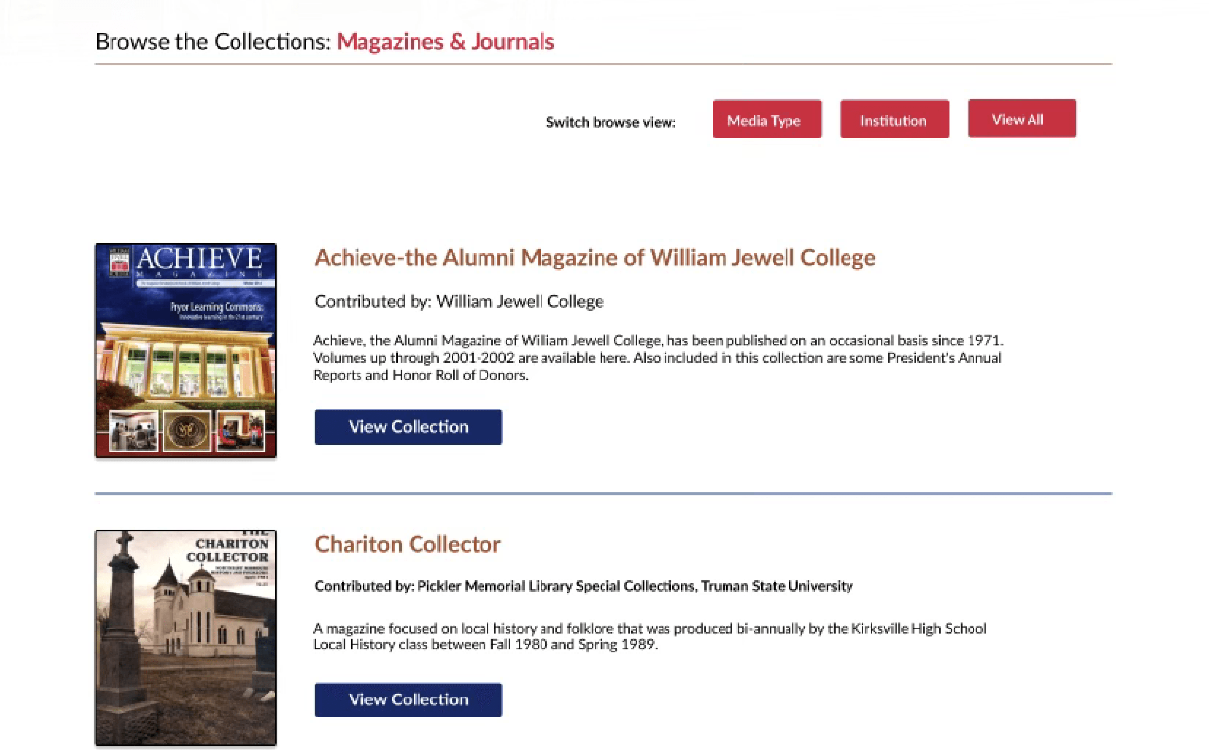
The Search by Media Type page was updated with a card-style layout, adding white space between cards to reduce clutter and improve readability.
Within Collections & Data, a search bar was added for custom searches, and search criteria were reorganized alphabetically for easier navigation. Scroll bars were added for browsing long lists, breadcrumbs for better orientation, and a new sorting feature lets users view results by year.
high-fidelity PROTOTYPE
MOCKUPS
Version 1 of the high-fidelity prototype built on user feedback from earlier testing, refining features, visuals, and functionality to better meet user needs. Key interactive elements include:
Collapsible Accordions — Let users expand or hide content on pages like Browse by Institution and Search Results.
Tooltips — Provide quick, page-specific guidance without adding clutter.
Pop-Out Sidebar — Opens from the hamburger menu for easy site navigation.
Return-to-Top Button — A gold button at the bottom of long pages for quick navigation.
Browse Buttons — Red buttons help users jump between browse categories.
Next Page Arrows — Allow users to flip through multi-page document previews.
Download Button — Enables users to save individual document pages.
TEST
USABILITY TESTING
To evaluate the new design, we conducted usability testing with three participants representing typical users of the Missouri State Archives site. Each participant completed tasks on both the original and redesigned versions, including:
Searching for specific volumes or keywords
Paging through documents
Downloading pages
We tracked:
i. Task completion time
ii. Mistakes made
iii. Pages accessed
iv. Number of clicks
EVALUATION
TESTING RESULTS
Feedback on the first high-fidelity prototype was largely positive, though several suggestions focused on visual design, navigation, and functionality.
Visual Design:
Participants and the instructor noted that some text was too dense. Additional suggestions included standardizing button colors on the homepage, increasing contrast on gray text boxes, adding borders to images for depth, using higher-resolution images, and breaking up transcript text for better readability.
Navigation:
Peers recommended improving clarity and ease of use by:
Adding visual cues to download-related buttons
Including traditional back buttons
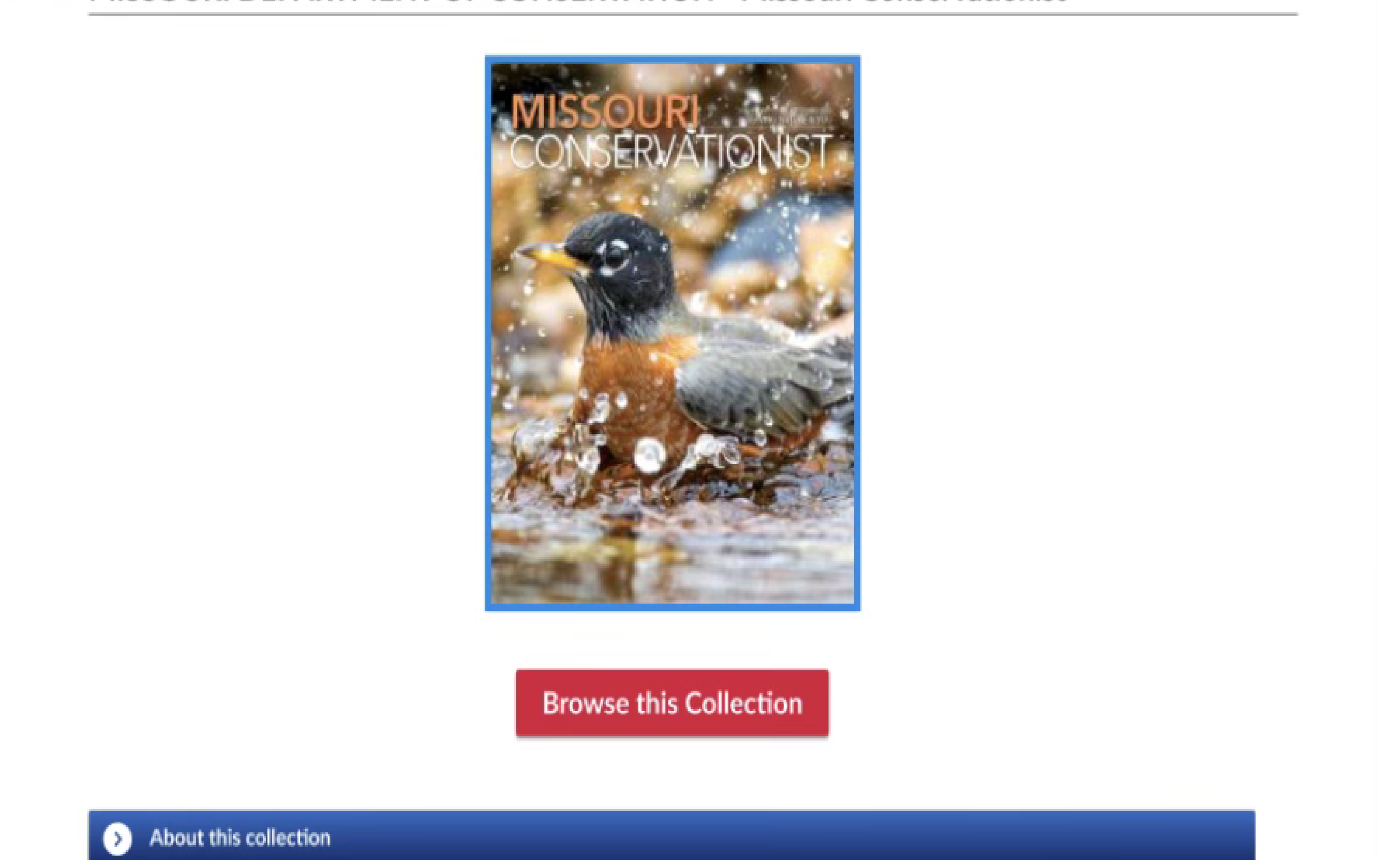
Clarifying the purpose of the “Browse” button on The Missouri Conservationist page
Reducing redundant buttons and limiting to a single, clear call to action for accessing the page
RECOMMENDATION
NEXT STEPS
Based on our design process and feedback, we recommend the following improvements for future iterations:
Conduct usability testing with a larger and more diverse group of target users to gather broader insights.
Explore multiple design variations during the wireframing stage to encourage creativity and experimentation.
Allocate more time for refining high-fidelity prototypes, allowing for greater transformation from early designs.
Enhance the prototype’s functionality to better replicate the full user experience of the live site.
Continue incorporating peer and instructor feedback while prioritizing direct input from real users.
REFLECTION
FINAL THOUGHTS
This project highlighted the value of iterative design and continuous user feedback. While peer and instructor evaluations were helpful, testing with real users provided the most relevant insights for improving usability.
One key learning was the importance of exploring multiple design concepts early on, rather than settling on a single idea too quickly. Greater experimentation during wireframing and prototyping could have led to stronger design solutions.
Time constraints limited both functionality and iteration in this project. With more time and resources, future work should focus on deeper user testing, expanded observations, and thoughtful refinements to both design and functionality for a more polished and complete product.
HOW DO USERS ACCESS THE SYSTEM?
“Where do you typically access the Missouri Archives CONTENTdm system?”
“What type of device do you use to access the Missouri Archives CONTENTdm system?”
HOW ARE
USERS SPECIFICALLY USING THE SYSTEM?
“What specific tasks do you typically perform in the system?”
“Can you explain your process for achieving the tasks identified?”
WHAT CHALLENGES DO USERS FACE WHILE USING THE SYSTEM?
“Any topics or concerns you would like to address regarding use of
the system?”
“Are there any particular frustrations you have when using the system?”


Original key screens


MAIN OBJECTIVE
Our goal was to redesign the website to improve search, streamline navigation, and create a more efficient, user-friendly experience for accessing archival materials.
INTERVIEWS
In addition to surveys, virtual interviews were conducted to gain further insight on common frustrations within CONTENTdm. This method allowed interviewees to share their screen and explain in further detail
UPDATED INFORMATION ARCHITECTURE
Below is the high-level architecture blueprint for the proposed system.
TESTING THE WIREFRAME
Reviewers responded positively to the redesign, especially the improved homepage, accessibility features, and refined search pane, which effectively supported user tasks.
Key functions were well-placed, though consistent placement of the document search panel—ideally on the left—was recommended for better alignment.
The use of white space, grouped content, and collapsible boxes was praised for reducing cognitive load and improving clarity.
Visuals were seen as solid, with suggestions to further refine fonts, colors, and imagery to strengthen the site’s identity and purpose.
TEST
USABILITY TESTING
To evaluate the new design, we conducted usability testing with three participants representing typical users of the Missouri State Archives site. Each participant completed tasks on both the original and redesigned versions, including:
Searching for specific volumes or keywords
Paging through documents
Downloading pages
We tracked:
i. Task completion time
ii. Mistakes made
iii. Pages accessed
iv. Number of clicks
POST-OBSERVATION QUESTIONS
After completing tasks, participants answered follow-up questions to gather qualitative feedback on ease of use, clarity, visual design, and overall satisfaction with the redesigned site.
USABILITY FORM
Participants also completed a 10-item usability form via Qualtrics. Using a 5-point Likert scale, the form collected detailed feedback on their experience with the updated website’s design and functionality.
RECOMMENDATION
NEXT STEPS
Based on our design process and feedback, we recommend the following improvements for future iterations:
Conduct usability testing with a larger and more diverse group of target users to gather broader insights.
Explore multiple design variations during the wireframing stage to encourage creativity and experimentation.
Allocate more time for refining high-fidelity prototypes, allowing for greater transformation from early designs.
Enhance the prototype’s functionality to better replicate the full user experience of the live site.
Continue incorporating peer and instructor feedback while prioritizing direct input from real users.
EVALUATION
TESTING RESULTS
Feedback on the first high-fidelity prototype was largely positive, though several suggestions focused on visual design, navigation, and functionality.
Visual Design:
Participants and the instructor noted that some text was too dense. Additional suggestions included standardizing button colors on the homepage, increasing contrast on gray text boxes, adding borders to images for depth, using higher-resolution images, and breaking up transcript text for better readability.
Navigation:
Peers recommended improving clarity and ease of use by:
Adding visual cues to download-related buttons
Including traditional back buttons
Clarifying the purpose of the “Browse” button on The Missouri Conservationist page
Reducing redundant buttons and limiting to a single, clear call to action for accessing the page
REFLECTION
FINAL THOUGHTS
This project highlighted the value of iterative design and continuous user feedback. While peer and instructor evaluations were helpful, testing with real users provided the most relevant insights for improving usability.
One key learning was the importance of exploring multiple design concepts early on, rather than settling on a single idea too quickly. Greater experimentation during wireframing and prototyping could have led to stronger design solutions.
Time constraints limited both functionality and iteration in this project. With more time and resources, future work should focus on deeper user testing, expanded observations, and thoughtful refinements to both design and functionality for a more polished and complete product.
EVALUATION
TESTING RESULTS
Feedback on the first high-fidelity prototype was largely positive, though several suggestions focused on visual design, navigation, and functionality.
Visual Design:
Participants and the instructor noted that some text was too dense. Additional suggestions included standardizing button colors on the homepage, increasing contrast on gray text boxes, adding borders to images for depth, using higher-resolution images, and breaking up transcript text for better readability.
Navigation:
Peers recommended improving clarity and ease of use by:
Adding visual cues to download-related buttons
Including traditional back buttons
Clarifying the purpose of the “Browse” button on The Missouri Conservationist page
Reducing redundant buttons and limiting to a single, clear call to action for accessing the page
How can we make a digital archive more accessible for all users?
Missouri Digital Archives
A website redesign focused on improved accessibility, search functionality, and usability.
Client
Missouri Digital Heritage
Date
September 2023 - December 2023
Industry
Government
Scope of work
Website Redesign
Interaction Design
UX/UI Design
THE CHALLENGE
INTRODUCTION
The Missouri State Archives site, built on CONTENTdm, poses usability issues for researchers due to poor search, inaccurate OCR, and a confusing interface. Its lack of accessibility features also limits access for visually impaired users, reducing overall usability and inclusivity.
MAIN OBJECTIVE
Our goal was to redesign the website to improve search, streamline navigation, and create a more efficient, user-friendly experience for accessing archival materials.
SURVEYS
CONDUCTING RESEARCH
To understand user needs and challenges, we used a Qualtrics survey to gather insights on user demographics, behaviors, goals, and frustrations with CONTENTdm. This method allowed archivists and researchers to share detailed, reflective feedback efficiently, helping us uncover key usability issues and design opportunities..
INTERVIEWS
In addition to surveys, virtual interviews were conducted to gain further insight on common frustrations within CONTENTdm. This method allowed interviewees to share their screen and explain in further detail

KEY INSIGHTS FROM USERS
RESEARCH RESULTS
Confusing Navigation: All users struggled with unintuitive navigation, often resorting to trial-and-error or browsing like a physical book.
Poor Search Functionality: Search was described as overly complex and ineffective, with users preferring to manually browse rather than use keyword search.
Accessibility Barriers: Screen readers cannot access non-transcribed content (like handwritten letters), limiting accessibility for visually impaired users.
Varied Usage Patterns: Users ranged from occasional to daily use, primarily for tasks like genealogical research, viewing documents, uploading materials, and creating metadata
USER PERSONAS
DEFINE
After analyzing our research, we created personas and scenarios to better understand user needs and build empathy.
CONCEPTUAL MODEL
DESIGN PLAN
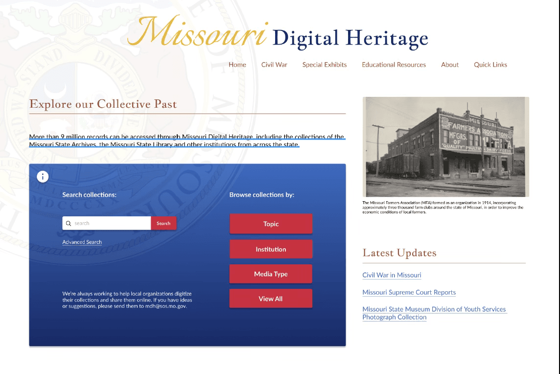
Upon arrival, users should encounter a clean homepage with a brief introduction, search bar, browse button, and clear instructions. Experienced users may dive straight into search, while others can explore the guidance provided.
The interface should feel familiar and intuitive. Searching mimics using a browser, browsing resembles exploring a library, and scanning results is akin to reading a menu or scrolling Google.
Key improvements include clearer download buttons, intuitive navigation arrows, adjustable font sizes, and responsive features like tooltips and helpful error messages to support less experienced users.
UPDATED INFORMATION ARCHITECTURE
Below is the high-level architecture blueprint for the proposed system.
WIREFRAME
LOW-FIDELITY PROTOTYPE
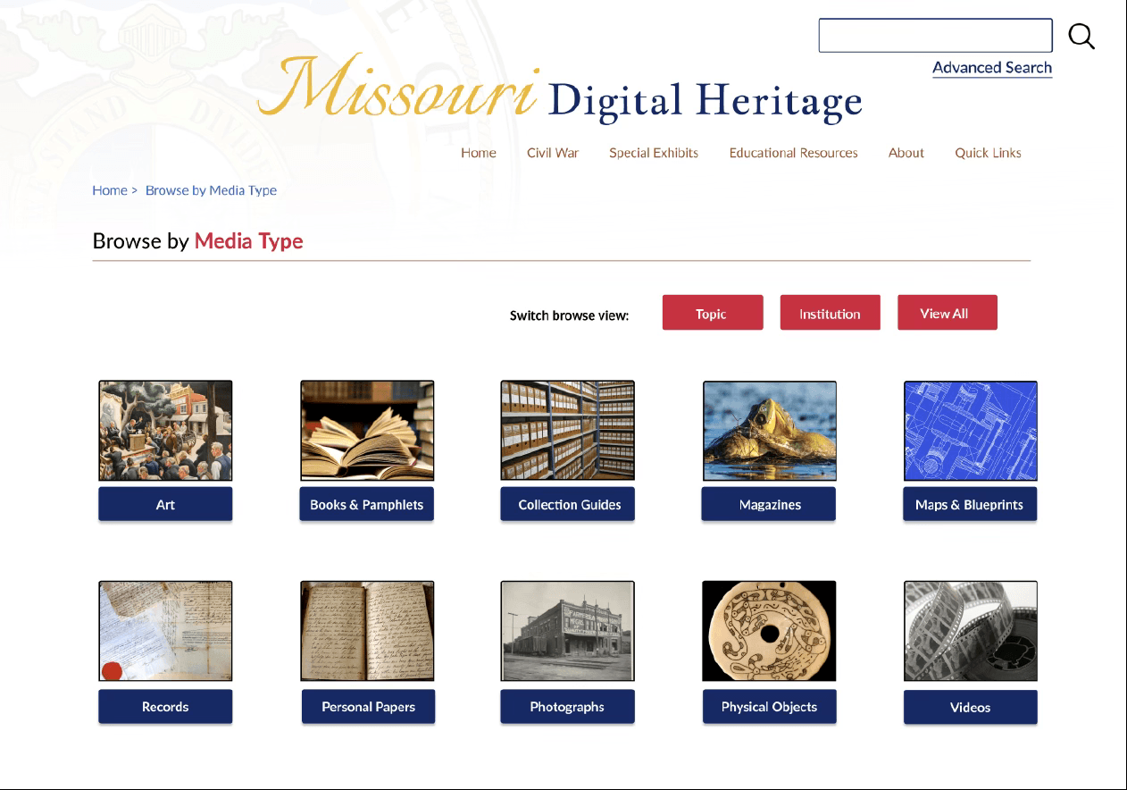
The homepage redesign focused on making search options more visible and intuitive by grouping them within a clearly defined search box.
The Search by Media Type page was updated with a card-style layout, adding white space between cards to reduce clutter and improve readability.
Within Collections & Data, a search bar was added for custom searches, and search criteria were reorganized alphabetically for easier navigation. Scroll bars were added for browsing long lists, breadcrumbs for better orientation, and a new sorting feature lets users view results by year.
TESTING THE WIREFRAME
Reviewers responded positively to the redesign, especially the improved homepage, accessibility features, and refined search pane, which effectively supported user tasks.
Key functions were well-placed, though consistent placement of the document search panel—ideally on the left—was recommended for better alignment.
The use of white space, grouped content, and collapsible boxes was praised for reducing cognitive load and improving clarity.
Visuals were seen as solid, with suggestions to further refine fonts, colors, and imagery to strengthen the site’s identity and purpose.
MOCKUPS
HIGH-FIDELITY PROTOTYPE
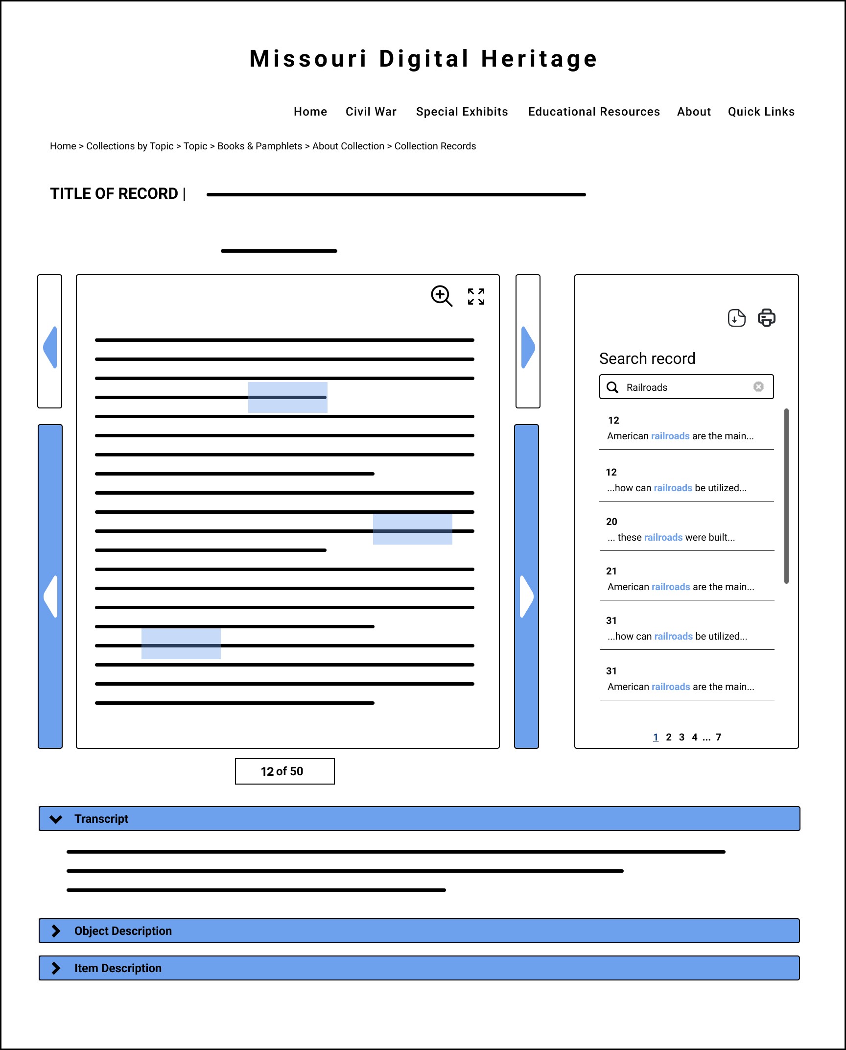
Version 1 of the high-fidelity prototype built on user feedback from earlier testing, refining features, visuals, and functionality to better meet user needs. Key interactive elements include:
Collapsible Accordions — Let users expand or hide content on pages like Browse by Institution and Search Results.
Tooltips — Provide quick, page-specific guidance without adding clutter.
Pop-Out Sidebar — Opens from the hamburger menu for easy site navigation.
Return-to-Top Button — A gold button at the bottom of long pages for quick navigation.
Browse Buttons — Red buttons help users jump between browse categories.
Next Page Arrows — Allow users to flip through multi-page document previews.
Download Button — Enables users to save individual document pages.


USABILITY TESTING
TEST
To evaluate the new design, we conducted usability testing with three participants representing typical users of the Missouri State Archives site. Each participant completed tasks on both the original and redesigned versions, including:
Searching for specific volumes or keywords
Paging through documents
Downloading pages
We tracked:
i. Task completion time
ii. Mistakes made
iii. Pages accessed
iv. Number of clicks
POST-OBSERVATION QUESTIONS
After completing tasks, participants answered follow-up questions to gather qualitative feedback on ease of use, clarity, visual design, and overall satisfaction with the redesigned site.
USABILITY FORM
Participants also completed a 10-item usability form via Qualtrics. Using a 5-point Likert scale, the form collected detailed feedback on their experience with the updated website’s design and functionality.
TESTING RESULTS
EVALUATION
Feedback on the first high-fidelity prototype was largely positive, though several suggestions focused on visual design, navigation, and functionality.
Visual Design:
Participants and the instructor noted that some text was too dense. Additional suggestions included standardizing button colors on the homepage, increasing contrast on gray text boxes, adding borders to images for depth, using higher-resolution images, and breaking up transcript text for better readability.
Navigation:
Peers recommended improving clarity and ease of use by:
Adding visual cues to download-related buttons
Including traditional back buttons
Clarifying the purpose of the “Browse” button on The Missouri Conservationist page
Reducing redundant buttons and limiting to a single, clear call to action for accessing the page
NEXT STEPS
RECOMMENDATION
Based on our design process and feedback, we recommend the following improvements for future iterations:
Conduct usability testing with a larger and more diverse group of target users to gather broader insights.
Explore multiple design variations during the wireframing stage to encourage creativity and experimentation.
Allocate more time for refining high-fidelity prototypes, allowing for greater transformation from early designs.
Enhance the prototype’s functionality to better replicate the full user experience of the live site.
Continue incorporating peer and instructor feedback while prioritizing direct input from real users.
FINAL THOUGHTS
REFLECTION
This project highlighted the value of iterative design and continuous user feedback. While peer and instructor evaluations were helpful, testing with real users provided the most relevant insights for improving usability.
One key learning was the importance of exploring multiple design concepts early on, rather than settling on a single idea too quickly. Greater experimentation during wireframing and prototyping could have led to stronger design solutions.
Time constraints limited both functionality and iteration in this project. With more time and resources, future work should focus on deeper user testing, expanded observations, and thoughtful refinements to both design and functionality for a more polished and complete product.